Layout
Implementation
In general use Bootstrap grid system for creating responsive content layout that is mobile friendly.
Not everything can be accomplished by using the grid system though and in these cases Flexbox might be useful.
Basic layout principles
- Main content scrolls vertically by default.
- Global search is located at the top of the page if it is offered.
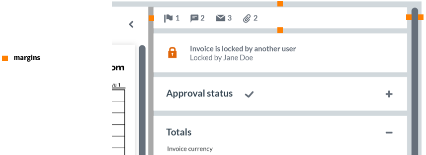
Margins
The common space between layout regions is a minimum of 0.7rem (default ~10px). This should be used in a consistent manner when defining borders between the elements.
Navigation
Menu
The application menu is rendered as a horizontal bar on the top of the viewport. The menu is providing access to the entire suite of installed applications. The application menu levels are kept to as few as possible.
- Desktop: Menu is shown always.
- Mobile: Menu that is toggled via a hamburger icon located on the page heading.
Example

Cash Management application main menu
Cash management is using a different main menu, which is not our common, but is specified only for them.