Brand
Visual identity
This section describes OpusCapita web services visual identity and includes instructions for rebranding. Visual consistency refers to logo usage, colors, font, footer, layout (described in the Layout page), icons (Described in the Design page) etc. Common look and feel serves two general purposes. First, it helps to identify a set of products from one OpusCapita brand. Second, it increases usability since users become familiar with how one view or service functions, and can transfer the experience to other views and services with the same look and feel.
Respect white space
If possible, give elements more space to make the UI more glanceable. The content needs high attention so keep it easy to perceive, breathable, yet efficient.
Longevity
The design is minimalistic and flat. This should keep the design fresh for a longer period.
OpusCapita Logo Usage
If background are is white, the logo is displayed in orange. White logo color is preferred when it is on top of the background color. Logo may be used in minimized mode only in case there is no option to use the larger logo.
Logo
Logo in white background
Logo in colored background
Minimized logo
Logo safety margins
Logo for favicon
Color scheme
The color scheme is based on selected OC brand colors (Orange, Yellow, Red, Black and Petrol), expanded with additional colors.
Basic color usage instructions
Color |
Meaning |
Use in OpusCapita |
|---|---|---|
|
Orange
#EC6608
R236 G102 B8
|
OpusCapita main brand color |
Buttons: Primary buttons (one per view) Links: Short and single links. Status: Warning. |
|
Steel
#67707C
R103 G112 B124
|
Buttons: Secondary buttons (one or many per view) Icons: Icons on white background. Text: Basic text color. |
|
|
Dark steel
#3B4A56
R59 G74 B86
|
Navigation |
Navigation: Navigation bar background color. |
|
Cyan
#3AA57B
R58 G165 B123
|
Success |
Status: Success. |
|
Yellow
#FECA1D
R254 G202 B29
|
Attention |
Focus: Is used for all components to indicate if it is focused or if one item in it has focus. Progress bars: Progress is indicated with yellow. |
|
Red
#DD2515
R211 G37 B21
|
Error |
Status: Error or unfinished. |
|
Petrol
#006070
R0 G96 B112
|
Links: Long and grouped links. |
|
|
Light gray
#D3DADE
R211 G218 B222
|
Background: Page background. |
|
|
Black
#000000
R0 G0 B0
|
Text: Secondary option for text color. Dimming: Dimming with 22% transparency. |
Colors in priority order for graphs with maximum of 5 colors.
Colors in priority order for graphs with maximum of 8 colors.
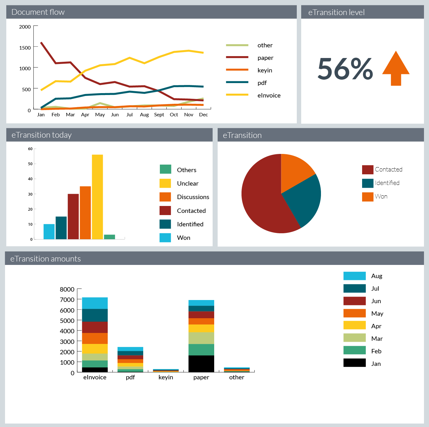
Colors in graphs - example image.
Typography
Fonts
OpusCapita product user interfaces use font Noto Sans by Google. This font is chosen because it supports different languages widely.
Font weights are light, normal and bold.
Fallback fonts are Helvetica Neue, Helvetica, Arial and sans-serif.
It is recommended to use relative font sizes. Check e.g. Guide for using flexible units of measurement for more information
Following weights are used with the fonts:
| Font-weight 300 light text |
| Font-weight 400 normal text |
| Font-weight 700 bold text |
h1. Heading |
h2. Heading |
h3. Heading |
h4. Heading |
| This is large text |
| This is medium text |
| This is normal text |
| This is small text |
Footer
The footer contains the OpusCapita logo and a copyright notice. The footer is located at the bottom of the viewport if the layout is shorter than the viewport. If the layout exceeds the height of the viewport, the footer is found at the bottom of the scrollable content area.

Rebranding 3rd party applications to OpusCapita brand
To achieve the visual look and feel of belonging to the OpusCapita brand in your service, these matters should be taken into account.
Mandatory
- Use the colors presented above.
- Use the OpusCapita logo.
- Use the OpusCapita favicon.
- Use the correct logo and background colors.
- Use the OpusCapita logo in footer.
Can be adjusted
- Layout of the content area elements can vary.
- Use the correct typography.
- Use the common button and icon style.
- Use the common login screen look and feel.
- Use the common footer as instructed in the Layout page.
- Pay attention to margins and avoid crowded looks.
Rebranding OpusCapita products to 3rd party brand
To achieve the visual look and feel of belonging to the 3rd party brand, these matters should be taken into account.
Mandatory
- Replace OpusCapita colors with 3rd party colors.
- Replace OpusCapita logo with 3rd party logo.
- Replace the OpusCapita favicon with 3rd party favicon.
- Use the text "Powered by" and the OpusCapita logo in footer.